Configuring and setting widgets
DataGOL offers a flexible way to visualize your data through configurable widgets. When you configure a widget, you're essentially defining what data is displayed and how it's presented visually. This involves selecting the specific columns for the x and y axis, deciding if the y-axis should display cumulative values, and choosing from a range of technical indicators to overlay. You also fine-tune the aesthetic details like numeric notations and chart label colors during configuration.
On the other hand, setting the widgets focuses on the overall structure and orientation of the chart. This is where you decide if multiple series should be stacked, whether to display the x and y axes labels, and if the chart should be rendered horizontally or vertically. Essentially, configuration deals with the data content and its immediate visual attributes, while settings govern the broader layout and presentation style of the widget.
KPI widget - configuration and setting
To configure KPI widget do the following:
-
From the right side of the widget generation page, click the Update Widget Column Configurations icon.

-
Configure any of the following:
| Items | Description |
|---|---|
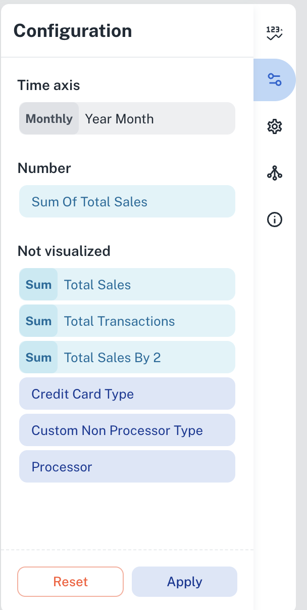
| Time axis | Click the field and change the title of the Time axis. |
| Number | Click the field and you can change the following:
|
| Not Visualized | Drag and drop items in this section into the Number section to view the KPI in the canvas region. |
To set the KPI widget, do the following:
- From the right side of the widget generation page, click the Update settings icon.
- Set the following:
| Item | Description |
|---|---|
| General | Set general details. |
| Title | Edit the title of the chart. |
| Subtitle | Edit the subtitle of the chart. |
| Help message | Type the message that appears when you hover over the help icon. |
| Number | Set the details of the displayed KPI. |
| Numeric Notation | Select how numerical values are displayed:
|
| Decimal Points | Specify the number of digits to display after the decimal point. |
| Show Date | Displays the date corresponding to the selected KPI period in the KPI widget. |
| Indicator | Set the details of the KPI trend comparison results. |
| Numeric notation | Select how numerical values are displayed:
|
| Decimal points | Specify the number of digits to display after the decimal point. |
| Show Date | Displays the date corresponding to the KPI comparison results period. |
| Positive color | Specify the color to display if the KPI is trending positively. |
| Negative color | Specify the color to display if the KPI is trending negatively. |
| Spark line | Select the check box to enable the Spark line or the Area chart that displays in the KPI widget. |
| Positive color | Specify the color to display if the KPI is trending positively on the Spark line. |
| Negative color | Specify the color to display if the KPI is trending negatively on the Spark line. |
| Linked reports | Set the details of the dashboard reports you want to view from this widget. |
| Linked report URL | Paste the URL of the dashboard that you want to view from this widget. |
| Open in New tab | Specify if you want to view the linked report in a different tab. |
Setting period comparison for KPI widgets
Period comparison in KPI widgets allows you to analyze data trends by comparing current and previous timeframes (e.g., month-to-month, quarter-to-quarter, year-to-year). DataGOL displays the current and previous period's metric value and the percentage change, enabling quick identification of performance fluctuations, seasonal trends, and the impact of various factors. For instance, a sales manager can compare this month's revenue to last month's, or a financial analyst can assess year-over-year growth. Highlighting these changes helps users identify issues or adjust strategies based on performance.
To perform KPI period comparison, do the following:
-
Select the specific metric in the workbook that you wish to analyze. This could be sales revenue, customer acquisition cost, website traffic, or any other relevant key performance indicator and create a visualization.
-
Apply a date filter to specify the period you want to analyze (e.g., Last Month, Last Quarter, Last Year). The KPI is displayed.
-
In the KPI configuration settings, click the metric and then the Comparison Criteria option and select the desired comparison period:
-
Previous Period: Compares the selected period with the immediately preceding period of the same duration (e.g., this month vs. last month, this year vs. last year).
-
Year period: Compares the selected year with the previous year.
The system will display the metric's value for the selected period and the comparison period, along with the percentage change.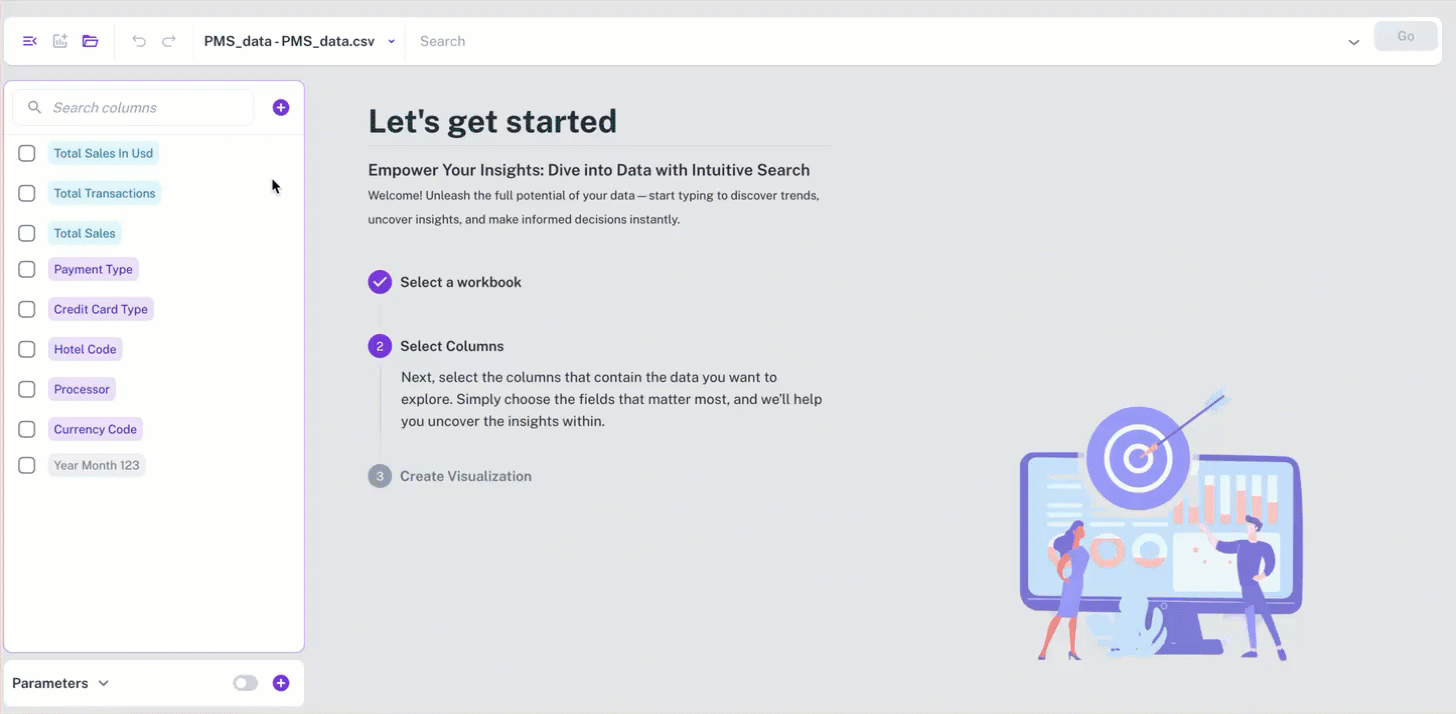
-
Relative Date for Date Filtering
When you set the date filter, the Relative Date option allows you to set the base date to reference the period used for analysis, especially when dealing with incomplete data for the current period.
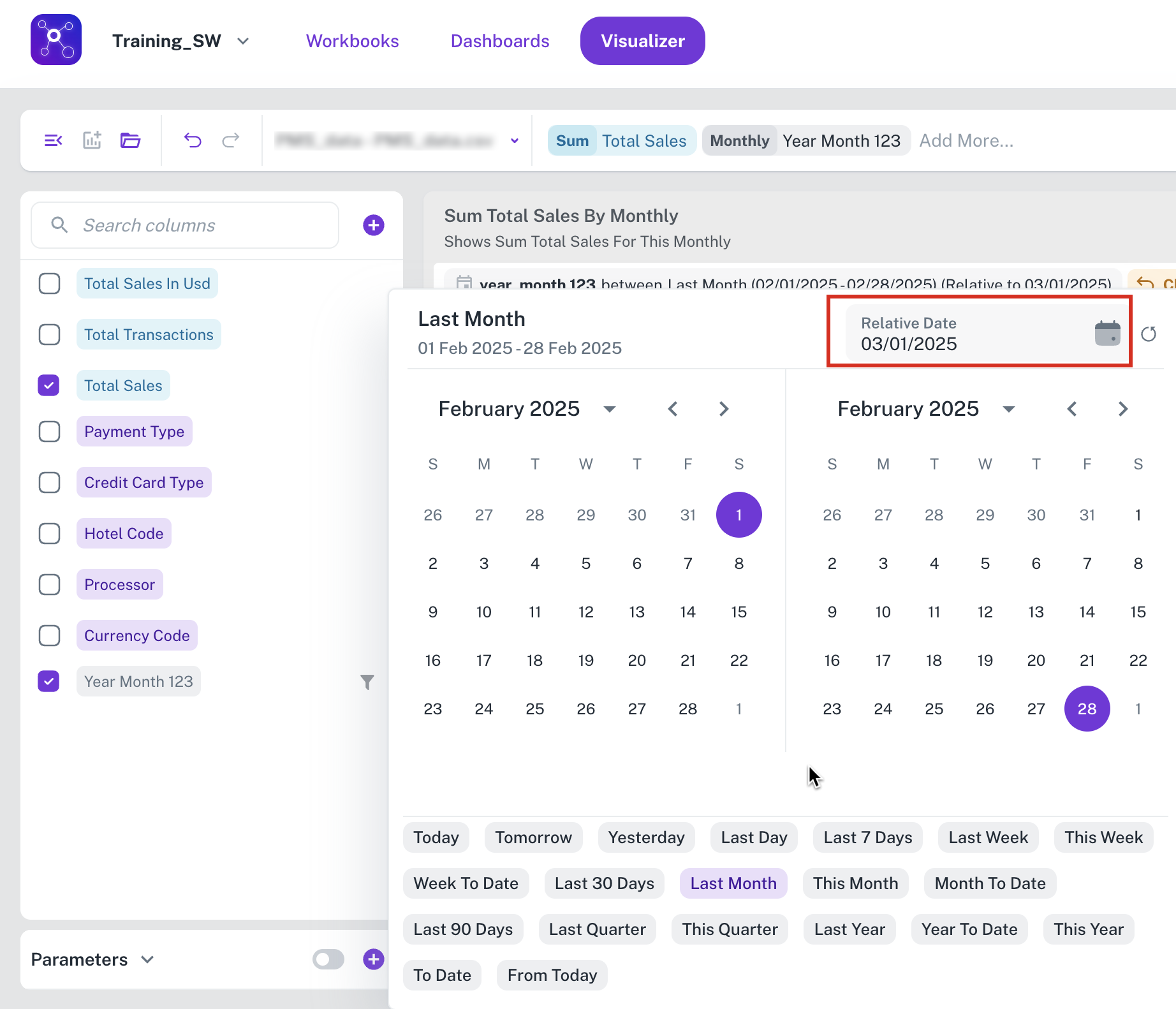
By specifying a relative date, such as March 1, 2025, you establish a consistent reference point for period calculations. Consequently, when applying a Last Month filter, the analysis will focus on the complete preceding month, in this case, February, 2025.
Bar chart widget - configuration and setting
To configure Bar chart widget do the following:
-
From the right side of the widget generation page, click the Update Widget Column Configurations icon.
-
Configure any of the following:
| Items | Description |
|---|---|
| X-Axis | Click the field to change the title of the X-Axis. |
| Y-Axis | Click the field and specify the following:
|
| Slice with color | Contains the column data which is color coded and presented. You drag and drop items in this section from Not Visualized section to visualize corresponding data. |
| Not Visualized | Drag and drop items in this section into the Slice with color section to view corresponding data in the canvas region. |
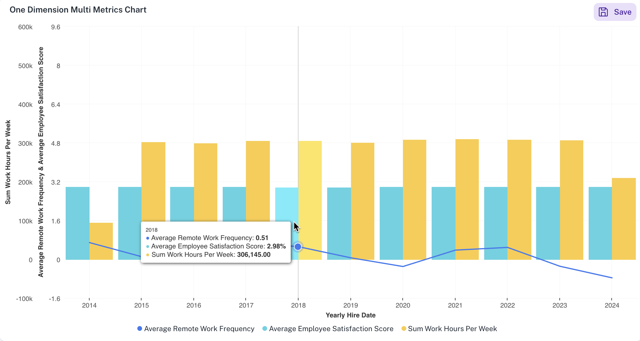
DataGOL supports plotting multiple metrics (Y-axis) against a single dimension (X-axis).
For example:
As shown in the image, for a single dimension such as Yearly Hire Date on the X-axis, our system can display multiple metrics such as Average Remote Work Frequency, Average Employee Satisfaction score and Sum work hours per week on the Y-axis. This would visualize a combination chart of bars and line.
To set the Bar chart widget, do the following:
-
From the right side of the widget generation page, click the Update settings icon.

-
Set the following:
Item Description General Set general details. Title Edit the title of the chart. Subtitle Edit the subtitle of the chart. Help message Type the message that appears when you hover over the help icon. Display Set the display details of the displayed Bar chart widget. X-Axis Grid Lines Check this option to view the X-Axis grid lines. Y-Axis Grid Lines Check this option to view the Y-Axis grid lines. Horizontal Check this option to view the bars in the chart horizontally. Stacked Select this option to view data in a stacked format. This is useful for visualizing how a total quantity is distributed among different categories. Also specify if you want to view the values in regular format or in percentage. Tooltip C heck this option for the chart tooltip and choose either to share all values in a single tooltip, or show each point's value separately. Linked reports Set the details of the dashboard reports you want to view from this widget. Linked report URL Paste the URL of the dashboard that you want to view from this widget. Open in New tab Specify if you want to view the linked report in a different tab.
Line chart widget - configuration and setting
To configure Line chart widget do the following:
-
From the right side of the widget generation page, click the Update Widget Column Configurations icon.
-
Configure any of the following:
Items Description X-Axis Click the field to change the title of the X-Axis. Y-Axis Click the field and specify the following: - Title: Change the title of the Y-Axis.
- Check Cumulative to keep the values cumulative
- Top/Bottom analysis pinpoints the highest (Top) or lowest (Bottom) performers within a dataset based on a chosen metric, displaying a specified number (N) of these entities for focused insights. You can set the direction which can be top or bottom and provide the number limit.
- Toggle Chart Data Label to change the color of the labels within the chart.
- Choose an option from the Numeric Notions to select how numerical values are displayed:
- Auto: The system automatically determines the most appropriate notation (standard, thousands, millions) based on the magnitude of the data.
- Thousands (K): Displays values in thousands, abbreviated with K (e.g., 10,000 becomes 10K).
- Millions (M): Displays values in millions, abbreviated with M (e.g., 1,000,000 becomes 1M).
- In Decimal, specify the number of digits to display after the decimal point.
- Click the + button next to Technical indicators to add any of the following technical indicators: Linear Regression, Moving Average, Trend Line
Slice with color Contains the column data which is color coded and presented. You drag and drop items in this section from Not Visualized section to visualize corresponding data. Not Visualized Drag and drop items in this section into the Slice with color section to view corresponding data in the canvas region.
To set the Line chart widget, do the following:
-
From the right side of the widget generation page, click the Update settings icon.
-
Set the following:
| Item | Description | |
|---|---|---|
| General | Set general details. | |
| Title | Edit the title of the chart. | |
| Subtitle | Edit the subtitle of the chart. | |
| Help message | Type the message that appears when you hover over the help icon. | |
| Display | Set the display details of the displayed Line chart widget. | |
| Y-Axis Grid Lines | Check this option to view the Y-Axis grid lines. | |
| Stacked | Select this option to view data in a stacked format. Stacked line charts show how multiple groups contribute to a total value over time. They display each group's values stacked on top of each other, illustrating both individual and overall trends. Also specify if you want to view the values in regular format or in percentage. | |
| Tooltip | Check this option for the chart tooltip and choose either to share all values in a single tooltip, or show each point's value separately. | |
| Linked reports | Set the details of the dashboard reports you want to view from this widget. | |
| Linked report URL | Paste the URL of the dashboard that you want to view from this widget. | |
| Open in New tab | Specify if you want to view the linked report in a different tab. |
Area chart widget - configuration and setting
To configure Area chart widget do the following:
-
From the right side of the widget generation page, click the Update Widget Column Configurations icon.
-
Configure any of the following:
Items Description X-Axis Click the field to change the title of the X-Axis. Y-Axis Click the field and specify the following: - Title: Change the title of the Y-Axis.
- Check Cumulative to keep the values cumulative
- Top/Bottom analysis pinpoints the highest (Top) or lowest (Bottom) performers within a dataset based on a chosen metric, displaying a specified number (N) of these entities for focused insights. You can set the direction which can be top or bottom and provide the number limit.
- Toggle Chart Data Label to change the color of the labels within the chart.
- Choose an option from the Numeric Notions to select how numerical values are displayed:
- Auto: The system automatically determines the most appropriate notation (standard, thousands, millions) based on the magnitude of the data.
- Thousands (K): Displays values in thousands, abbreviated with K (e.g., 10,000 becomes 10K).
- Millions (M): Displays values in millions, abbreviated with M (e.g., 1,000,000 becomes 1M).
- In Decimal, specify the number of digits to display after the decimal point.
- Click the + button next to Technical indicators to add any of the following technical indicators: Linear Regression, Moving Average, Trend Line
Slice with color Contains the column data which is color coded and presented. You drag and drop items in this section from Not Visualized section to visualize corresponding data. Not Visualized Drag and drop items in this section into the Slice with color section to view corresponding data in the canvas region.
To set the Area chart widget, do the following:
-
From the right side of the widget generation page, click the Update settings icon.
-
Set the following:
Item Description General Set general details. Title Edit the title of the chart. Subtitle Edit the subtitle of the chart. Help message Type the message that appears when you hover over the help icon. Display Set the display details of the displayed Area chart widget. Y-Axis Grid Lines Check this option to view the Y-Axis grid lines. Horizontal Check this option to view the bars in the chart horizontally. Stacked Select this option to view data in a stacked format. Stacked line charts show how multiple groups contribute to a total value over time. They display each group's values stacked on top of each other, illustrating both individual and overall trends. Also specify if you want to view the values in regular format or in percentage. Tooltip Check this option for the chart tooltip and choose either to share all values in a single tooltip, or show each point's value separately. Linked reports Set the details of the dashboard reports you want to view from this widget. Linked report URL Paste the URL of the dashboard that you want to view from this widget. Open in New tab Specify if you want to view the linked report in a different tab.
Scatter chart widget - configuration and setting
To configure Scatter chart widget do the following:
-
From the right side of the widget generation page, click the Update Widget Column Configurations icon.
-
Configure any of the following:
Items Description X-Axis Click the field to change the title of the X-Axis. Y-Axis Click the field and specify the following: - Title: Change the title of the Y-Axis.
- Check Cumulative to keep the values cumulative
- Top/Bottom analysis pinpoints the highest (Top) or lowest (Bottom) performers within a dataset based on a chosen metric, displaying a specified number (N) of these entities for focused insights. You can set the direction which can be top or bottom and provide the number limit.
- Toggle Chart Data Label to change the color of the labels within the chart.
- Choose an option from the Numeric Notions to select how numerical values are displayed:
- Auto: The system automatically determines the most appropriate notation (standard, thousands, millions) based on the magnitude of the data.
- Thousands (K): Displays values in thousands, abbreviated with K (e.g., 10,000 becomes 10K).
- Millions (M): Displays values in millions, abbreviated with M (e.g., 1,000,000 becomes 1M).
- In Decimal, specify the number of digits to display after the decimal point.
- Click the + button next to Technical indicators to add any of the following technical indicators: Linear Regression, Moving Average, Trend Line
Slice with color Contains the column data which is color coded and presented. You drag and drop items in this section from Not Visualized section to visualize corresponding data. Not Visualized Drag and drop items in this section into the Slice with color section to view corresponding data in the canvas region.
To set the Scatter chart widget, do the following:
-
From the right side of the widget generation page, click the Update settings icon.
-
Set the following:
Item Description General Set general details. Title Edit the title of the chart. Subtitle Edit the subtitle of the chart. Help message Type the message that appears when you hover over the help icon. Display Set the display details of the displayed Area chart widget. Y-Axis Grid Lines Check this option to view the Y-Axis grid lines. Stacked Select this option to view data in a stacked format. Stacked line charts show how multiple groups contribute to a total value over time. They display each group's values stacked on top of each other, illustrating both individual and overall trends. You can also specify if you want to view the values in regular format or in percentage. Tooltip Check this option for the chart tooltip and choose either to share all values in a single tooltip, or show each point's value separately. Linked reports Set the details of the dashboard reports you want to view from this widget. Linked report URL Paste the URL of the dashboard that you want to view from this widget. Open in New tab Specify if you want to view the linked report in a different tab.
Packed bubble chart widget - configuration and setting
To configure Packed bubble chart widget do the following:
-
From the right side of the widget generation page, click the Update Widget Column Configurations icon.
-
Configure any of the following:
Items Description Categories Click the field to change the title of the categories. Size Click the field and specify the following: - Title: Change the title of the Packed Bubble chart widget.
- Toggle Chart Data Label to change the color of the labels within the bubbles.
- Top/Bottom analysis pinpoints the highest (Top) or lowest (Bottom) performers within a dataset based on a chosen metric, displaying a specified number (N) of these entities for focused insights. You can set the direction which can be top or bottom and provide the number limit.
- Choose an option from the Numeric Notions to select how numerical values are displayed:
- Auto: The system automatically determines the most appropriate notation (standard, thousands, millions) based on the magnitude of the data.
- Thousands (K): Displays values in thousands, abbreviated with K (e.g., 10,000 becomes 10K).
- Millions (M): Displays values in millions, abbreviated with M (e.g., 1,000,000 becomes 1M).
- In Decimal, specify the number of digits to display after the decimal point.
To set the Packed Bubble chart widget, do the following:
-
From the right side of the widget generation page, click the Update settings icon.
-
Set the following:
| Item | Description | |
|---|---|---|
| General | Set general details. | |
| Title | Edit the title of the chart. | |
| Subtitle | Edit the subtitle of the chart. | |
| Help message | Type the message that appears when you hover over the help icon. | |
| Tooltip | Check this option for the chart tooltip and choose either to share all values in a single tooltip, or show each point's value separately. | |
| Linked reports | Set the details of the dashboard reports you want to view from this widget. | |
| Linked report URL | Paste the URL of the dashboard that you want to view from this widget. | |
| Open in New tab | Specify if you want to view the linked report in a different tab. |
Pie chart widget - configuration and setting
To configure Pie chart widget do the following:
-
From the right side of the widget generation page, click the Update Widget Column Configurations icon.
-
Configure any of the following:
Items Description Categories Click the field to change the title of the categories. Values Click the field and specify the following: - Title: Change the title of the Pie chart widget.
- Top/Bottom analysis pinpoints the highest (Top) or lowest (Bottom) performers within a dataset based on a chosen metric, displaying a specified number (N) of these entities for focused insights. You can set the direction which can be top or bottom and provide the number limit.
- Toggle Chart Data Label to change the color of the labels within the bubbles.
- Choose an option from the Numeric Notions to select how numerical values are displayed:
- Auto: The system automatically determines the most appropriate notation (standard, thousands, millions) based on the magnitude of the data.
- Thousands (K): Displays values in thousands, abbreviated with K (e.g., 10,000 becomes 10K).
- Millions (M): Displays values in millions, abbreviated with M (e.g., 1,000,000 becomes 1M).
- In Decimal, specify the number of digits to display after the decimal point.
Any time you can click the Reset Filter button and reset the specifications. Not Visualized Drag and drop items in this section to visualize the corresponding data in the canvas region.
To set the Pie chart widget, do the following:
-
From the right side of the widget generation page, click the Update settings icon.
-
Set the following:
Item Description General Set general details. Title Edit the title of the chart. Subtitle Edit the subtitle of the chart. Help message Type the message that appears when you hover over the help icon. Tooltip Check this option for the chart tooltip which is shown within the pie chart. Linked reports Set the details of the dashboard reports you want to view from this widget. Linked report URL Paste the URL of the dashboard that you want to view from this widget. Open in New tab Specify if you want to view the linked report in a different tab.
Donut chart widget - configuration and setting
To configure Donut chart widget do the following:
-
From the right side of the widget generation page, click the Update Widget Column Configurations icon.
-
Configure any of the following:
Items Description Categories Click the field to change the title of the categories. Values Click the field and specify the following: - Title: Change the title of the Donut chart widget.
- Top/Bottom analysis pinpoints the highest (Top) or lowest (Bottom) performers within a dataset based on a chosen metric, displaying a specified number (N) of these entities for focused insights. You can set the direction which can be top or bottom and provide the number limit.
- Toggle Chart Data Label to change the color of the labels within the bubbles.
- Choose an option from the Numeric Notions to select how numerical values are displayed:
- Auto: The system automatically determines the most appropriate notation (standard, thousands, millions) based on the magnitude of the data.
- Thousands (K): Displays values in thousands, abbreviated with K (e.g., 10,000 becomes 10K).
- Millions (M): Displays values in millions, abbreviated with M (e.g., 1,000,000 becomes 1M).
- In Decimal, specify the number of digits to display after the decimal point.
Any time you can click the Reset Filter button and reset the specifications. Not Visualized Drag and drop items in this section to visualize the corresponding data in the canvas region.
To set the Donut chart widget, do the following:
-
From the right side of the widget generation page, click the Update settings icon.
-
Set the following:
Item Description General Set general details. Title Edit the title of the chart. Subtitle Edit the subtitle of the chart. Help message Type the message that appears when you hover over the help icon. Tooltip Check this option for the chart tooltip which is shown within the pie chart. Linked reports Set the details of the dashboard reports you want to view from this widget. Linked report URL Paste the URL of the dashboard that you want to view from this widget. Open in New tab Specify if you want to view the linked report in a different tab.
Funnel chart widget - configuration and setting
To configure Funnel chart widget do the following:
-
From the right side of the widget generation page, click the Update Widget Column Configurations icon.
-
Configure any of the following:
Items Description Categories Click the field to change the title of the categories. Values Click the field and specify the following: - Title: Change the title of the Funnel chart widget.
- Top/Bottom analysis pinpoints the highest (Top) or lowest (Bottom) performers within a dataset based on a chosen metric, displaying a specified number (N) of these entities for focused insights. You can set the direction which can be top or bottom and provide the number limit.
- Toggle Chart Data Label to change the color of the labels within the bubbles.
- Choose an option from the Numeric Notions to select how numerical values are displayed:
- Auto: The system automatically determines the most appropriate notation (standard, thousands, millions) based on the magnitude of the data.
- Thousands (K): Displays values in thousands, abbreviated with K (e.g., 10,000 becomes 10K).
- Millions (M): Displays values in millions, abbreviated with M (e.g., 1,000,000 becomes 1M).
- In Decimal, specify the number of digits to display after the decimal point.
Reset Filter At any time, you can click the Reset Filter button to reset the specifications. Not Visualized Drag and drop items in this section to visualize the corresponding data in the canvas region.
To set the Funnel chart widget, do the following:
-
From the right side of the widget generation page, click the Update settings icon.
-
Set the following:
Item Description General Set general details. Title Edit the title of the chart. Subtitle Edit the subtitle of the chart. Help message Type the message that appears when you hover over the help icon. Tooltip Check this option for the chart tooltip which is shown within the pie chart. Linked reports Set the details of the dashboard reports you want to view from this widget. Linked report URL Paste the URL of the dashboard that you want to view from this widget. Open in New tab Specify if you want to view the linked report in a different tab.
Tree map chart widget - configuration and setting
To configure Tree map chart widget do the following:
-
From the right side of the widget generation page, click the Update Widget Column Configurations icon.
-
Configure any of the following:
Items Description Categories Click the field to change the title of the categories. Intensity Click the field and specify the following: - Title: Change the title of the Pie chart widget.
- Top/Bottom analysis pinpoints the highest (Top) or lowest (Bottom) performers within a dataset based on a chosen metric, displaying a specified number (N) of these entities for focused insights. You can set the direction which can be top or bottom and provide the number limit.
- Toggle Chart Data Label to change the color of the labels within the bubbles.
- Choose an option from the Numeric Notions to select how numerical values are displayed:
- Auto: The system automatically determines the most appropriate notation (standard, thousands, millions) based on the magnitude of the data.
- Thousands (K): Displays values in thousands, abbreviated with K (e.g., 10,000 becomes 10K).
- Millions (M): Displays values in millions, abbreviated with M (e.g., 1,000,000 becomes 1M).
- In Decimal, specify the number of digits to display after the decimal point.
Reset Filter At any time, you can click the Reset Filter button to reset the specifications. Not Visualized Drag and drop items in this section into the Slice with color section to visualize the corresponding data in the canvas region.
To set the Tree map widget, do the following:
-
From the right side of the widget generation page, click the Update settings icon.
-
Set the following:
Item Description General Set general details. Title Edit the title of the chart. Subtitle Edit the subtitle of the chart. Help message Type the message that appears when you hover over the help icon. Tooltip Check this option for the chart tooltip which is shown within the pie chart. Linked reports Set the details of the dashboard reports you want to view from this widget. Linked report URL Paste the URL of the dashboard that you want to view from this widget. Open in New tab Specify if you want to view the linked report in a different tab.
Box plot widget - configuration and setting
To configure Box plot widget do the following:
-
From the right side of the widget generation page, click the Update Widget Column Configurations icon.
-
Configure any of the following:
Items Description X-Axis Click the field to change the title of the X-Axis. Y-Axis Click the field and specify the following: - Title: Change the title of the Y-Axis.
- Color: Change the color of the boxes.
- Top/Bottom analysis pinpoints the highest (Top) or lowest (Bottom) performers within a dataset based on a chosen metric, displaying a specified number (N) of these entities for focused insights. You can set the direction, which can be top or bottom, and provide the number limit.
Not Visualized Lists the selected columns that are not yet visualized in the canvas.
To set the Box plot widget, do the following:
-
From the right side of the widget generation page, click the Update settings icon.
-
Set the following:
Item Description General Set general details. Title Edit the title of the chart. Subtitle Edit the subtitle of the chart. Help message Type the message that appears when you hover over the help icon. Display Set the display details of the displayed Area chart widget. X-Axis Grid Lines Check this option to view the X-Axis grid lines. Y-Axis Grid Lines Check this option to view the Y-Axis grid lines. Tooltip Check this option to enable the chart tooltip. Linked reports Set the details of the dashboard reports you want to view from this widget. Linked report URL Paste the URL of the dashboard that you want to view from this widget. Open in New tab Specify if you want to view the linked report in a different tab.
Table widget - configuration and setting
To configure Table widget do the following:
-
From the right side of the widget generation page, click the Update Widget Column Configurations icon.
-
Configure any of the following:
Items Description Visible columns Drag the items to reorder the columns in the table. Click any of the values to: - Change the title of the value column.
- Specify the sorting order: Ascending or Descending.
- Utilize Top/Bottom analysis to pinpoint the highest (Top) or lowest (Bottom) performers within a dataset based on a chosen metric, displaying a specified number (N) of these entities for focused insights. You can set the direction (top or bottom) and provide the number limit.
- Choose an option from the Numeric Notions to select how numerical values are displayed:
- Auto: The system automatically determines the most appropriate notation (standard, thousands, millions) based on the magnitude of the data.
- Thousands (K): Displays values in thousands, abbreviated with K (e.g., 10,000 becomes 10K).
- Millions (M): Displays values in millions, abbreviated with M (e.g., 1,000,000 becomes 1M).
- In Decimal, specify the number of digits to display after the decimal point.
- Conditional format the columns and create rules for the same. Refer to Conditional formatting for tables and Pivot tables.
Not Visualized Lists the selected columns that are not yet visualized in the canvas.
To set the Table widget, do the following:
-
From the right side of the widget generation page, click the Update settings icon.
-
Set the following:
Item Description General Set general details. Title Edit the title of the chart. Subtitle Edit the subtitle of the chart. Help message Type the message that appears when you hover over the help icon. Display Set the display details of the table. Density Specify the density of each row. The following options are available: Short, Medium, Tall, and Extra Tall. Normal/Zebra Row Choose whether to maintain normal rows or Zebra rows in a table, which are alternating shades of color applied to the rows. Linked reports Set the details of the dashboard reports you want to view from this widget. Linked report URL Paste the URL of the dashboard that you want to view from this widget. Open in New tab Specify if you want to view the linked report in a different tab.
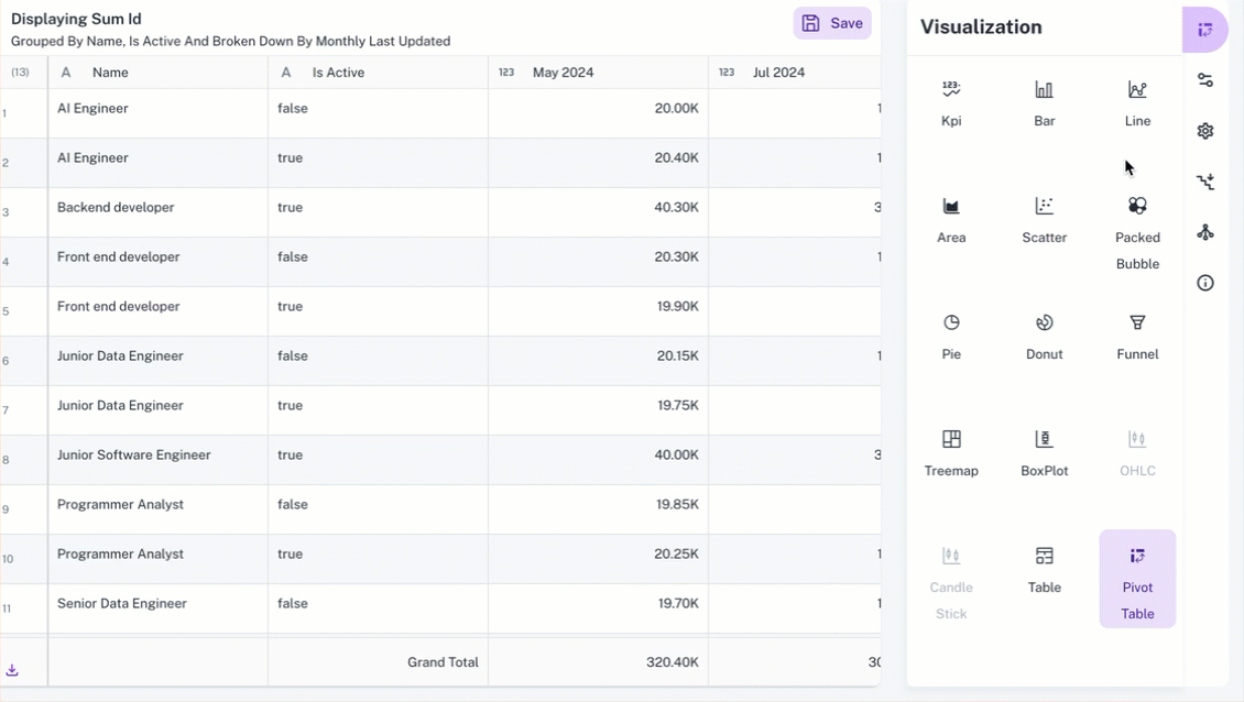
Pivot Table widget - configuration and setting
To configure PivotTable widget do the following:
-
From the right side of the widget generation page, click the Update Widget Column Configurations icon.
-
Configure any of the following:
Items Description Rows Click any value in this section to edit the column title. Drag and drop the items in this section to reorder the columns in the pivot table. Columns Click any value in this section to edit the column title. Values You can pivot the table by dragging items in this section into Rows or Columns section. Click the value and you can do the following: - Top/Bottom analysis pinpoints the highest (Top) or lowest (Bottom) performers within a dataset based on a chosen metric, displaying a specified number (N) of these entities for focused insights. You can set the direction which can be top or bottom and provide the number limit.
- Conditional format the columns and create rules for the same. Refer to Conditional formatting for tables and Pivot tables.
Not Visualized Lists the selected columns that are not yet visualized in the canvas.
To set the Pivot Table widget, do the following:
-
From the right side of the widget generation page, click the Update settings icon.
-
Set the following:
Item Description General Set general details. Title Edit the title of the chart. Subtitle Edit the subtitle of the chart. Help message Type the message that appears when you hover over the help icon. Display Set the display details of the table. View Type Select the view type: - Flat view is the regular pivot table view.
- - Tree view. Refer to Tree view for more details.
Density Specify the density of each row. The following options are available: Short, Medium, Tall, and Extra Tall. Normal/Zebra Row Choose whether to maintain normal rows or Zebra rows in a table, which are alternating shades of color applied to the rows. Heatmap Enable Heatmap and choose the right scaling method to highlight patterns and reveal insights in your pivot table data. You can also define color stops to create a gradient that visually represents your data values. Each stop specifies a color at a specific position (0-100%) in the range. Number Notation Choose an option from the Numeric Notions to select how numerical values are displayed: - Auto: The system automatically determines the most appropriate notation (standard, thousands, millions) based on the magnitude of the data.
- Thousands (K): Displays values in thousands, abbreviated with K (e.g., 10,000 becomes 10K).
- Millions (M): Displays values in millions, abbreviated with M (e.g., 1,000,000 becomes 1M).
Decimal Specify the number of digits to display after the decimal point. Linked reports Set the details of the dashboard reports you want to view from this widget. Linked report URL Paste the URL of the dashboard that you want to view from this widget. Open in New tab Specify if you want to view the linked report in a different tab.
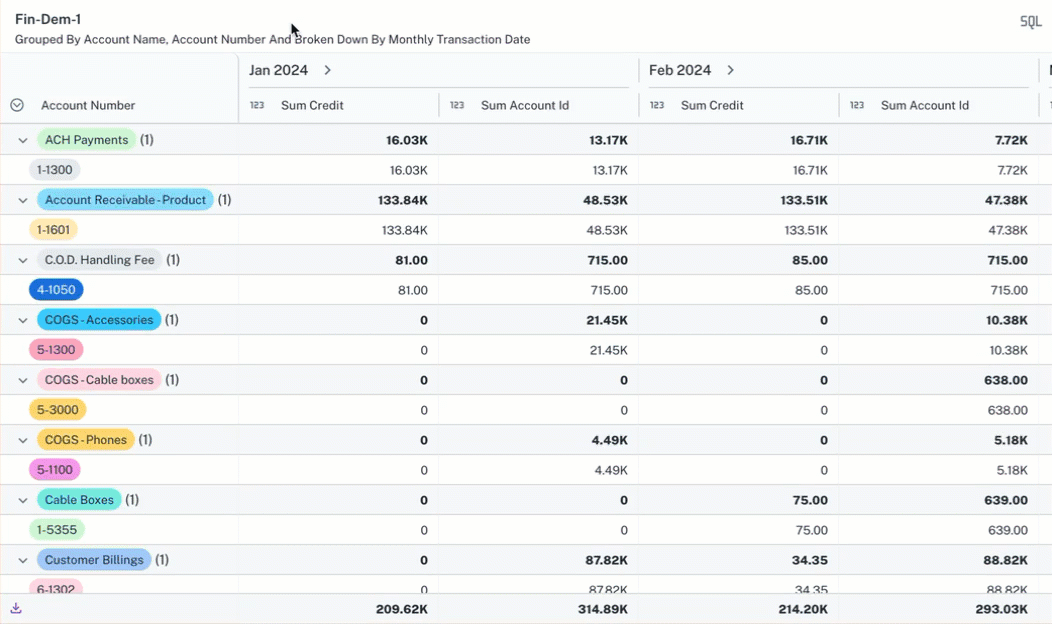
Pivot table - Tree view
The Tree view in the Pivot table of a widget offers a hierarchical representation of data, opposed to the Flat view, which presents data in a standard table format. Here are the key features of the Tree view in a pivot table
-
Hierarchical Structure
-
The tree view allows users to group data into nested categories, showing relationships between different data points.
For example, it can display sales data grouped by currency, and then further broken down by credit card type within each currency. -
This provides a drill-down capability, allowing users to explore data at different levels of detail.
-
-
Subtotal Calculations:
-
The tree view automatically calculates subtotals for each level of the hierarchy. These subtotals provide aggregated values for the grouped data, making it easier to understand overall trends and patterns.
-
For example, the sum of all transactions for a specific credit card type within a specific currency is shown as a subtotal.
-
-
Flexibility and Customization:
-
Users can rearrange rows and columns to change the grouping and aggregation of data, providing flexibility in how they analyze the information. The user can change the location of the data fields, moving them from row to column and vice versa.
-
Options like Density (how small the cells appear), Zebra (alternate row highlighting), and Numeric representation (displaying values in thousands, millions, or auto) allow for visual customization.
-
Adding multiple columns or complex groupings can lead to performance issues or errors.
Setting the Tree view for pivot table
-
From a widget, click the Change Visualization/Widget Type button and select Pivot table.
-
Click Update settings button, set the following in the Settings box and click Apply.
Field Description Display View Type Select Tree View. Density Specifies the desired cell size. Lower density values result in smaller, more detailed cells. Normal/Zebra Rows Applies alternating background colors to rows or columns, creating a zebra stripe effect to enhance visual distinction. Number Numeric Notations Display values in thousands (K), millions (M), or automatically. Decimal Points Specifies the decimal point. 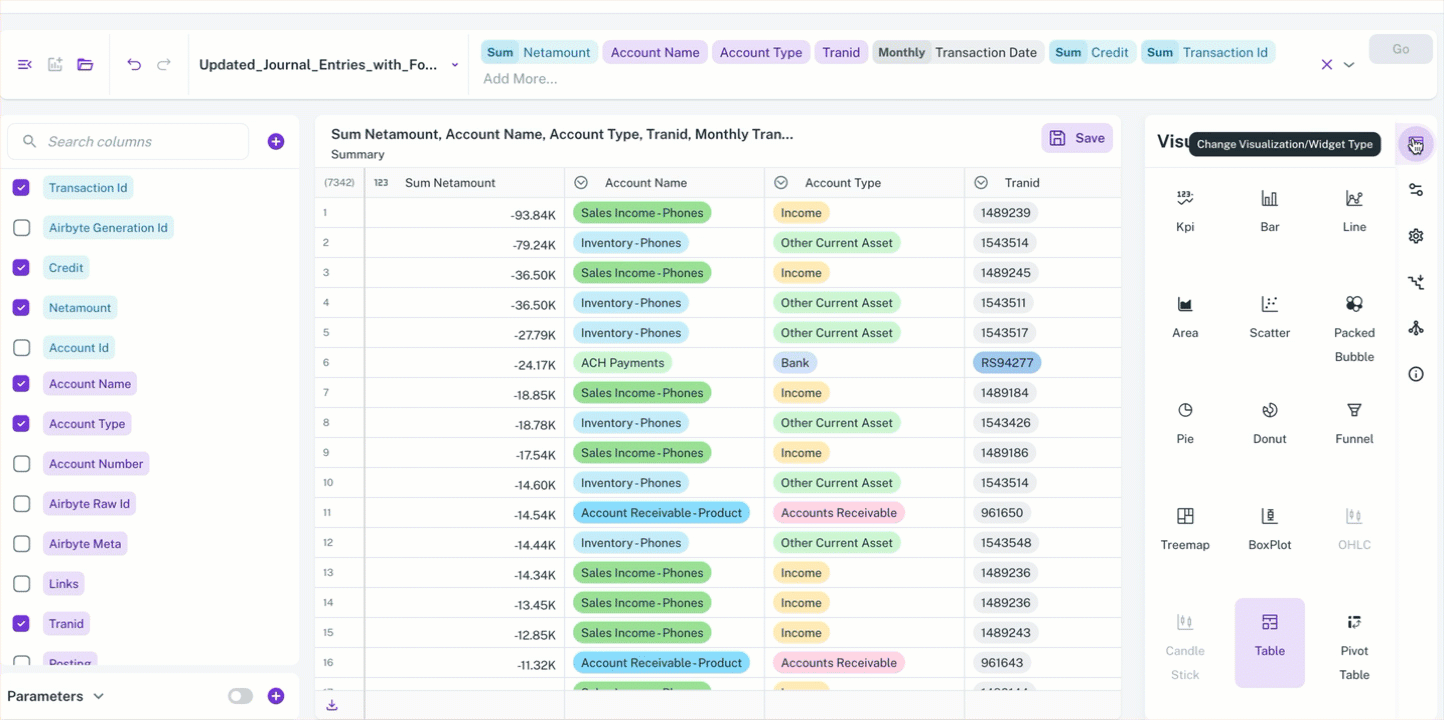
You can rearrange rows and columns to control how your data is grouped and aggregated, providing you with maximum flexibility for analysis. You can also manipulate the location of data fields, switching them between rows and columns as needed.